
These magazine articles have definitely given us some good ideas to include on our own article which we can use to create it to a high standard. I have also noticed that continuity is of massive importance between the digipak, article and the music video itself.

In terms of front covers this one shows a negative representation as Michael Jackson has very clear stubble and messy hair. If they wanted it to be shown as positive, then this would’ve been altered. Also, it shows that he is a dark character due to the glasses and how he appears. The tagline is “Inside his mad, bad world.” The tagline also suggests that the upcoming article is taking us inside his head. The lighting used during the taking of this picture is used to show how pale his face really is and draw the audience in to view it. Also, it’s a negative representation.
The connotation of this is that Michael
Jackson is starting to lose it and eventually leads to him supposedly killing
himself. The tagline “Inside his mad,
bad world” also anchors towards this, to show that he is a troubled man and has
bad problems at the moment. The denotation of this magazine is that
Michael Jackson is portrayed as a negative representation and that the magazine
company obviously don’t want Jackson to be seen as a normal, chilled-out
person.
The masthead is iconic as it
is in bold red and is prominent on the front cover. The magazine is made by the
Baeur Media Group and is a very recognizable brand. Also, it is not covering up
any of Jackson’s face as this would not fit the conventions and would not be
appealing to the buyers.
The key image here is Michael Jackson. The masthead is partially obscured, but
very effective. All the block quotes are carefully arranged around the key
image and are easily visible. Also, they are arranged in certain points so that
the main key image is not blocked
and the attention of the viewers is still drawn towards him completely.
The USP
for this edition of the magazine is always the key image because they are featured in the magazine. It is also an
exclusive article for them in this magazine. There could also be interviews
with Michael Jackson, meaning it is exclusive to the Baeur Media Group. The skyline follows convention as it’s
placed in a suitable position. Also, the tagline states that it’s the UK’s
biggest music magazine and shows us that the target audience is musicians and
people who enjoy music. It also fits the
conventions because many celebrities
wear them, especially on the front of magazine covers. It shows that there is
mystery surrounding him and the magazine article. Synergy is also used here to sell the magazine and the artist’s
music.
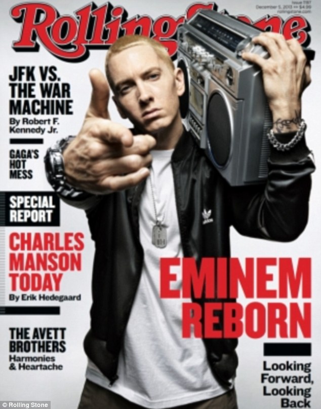 Overall, this magazine cover is not an entirely great promotion of Michael Jackson due to the wording used and the picture used of him, however it gets him into people's minds meaning that they go back and purchase his music to listen to it. I personally feel that this Eminem article shows a lot more happiness in a way and shows to me that he has a love for music because he is holding a stereo. To me this article is far more exciting and the positioning of Eminem makes it look as if he is is 3D almost, which to me is far more interesting. It is also sharing how they believe Eminem is "Reborn" whereas the other media company are making Michael Jackson's music seem like no more just because he passed away.
No comments:
Post a Comment